Creating Charts with Insert Chart
To create charts using the Insert Chart tab, follow the steps given below.
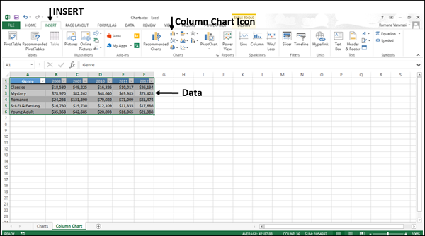
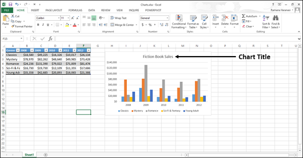
Step 1 − Select the data.
Step 2 − Click the Insert tab on the Ribbon.
Step 3 − Click the Insert Column Chart on the Ribbon.
The 2-D column, 3-D Column chart options are displayed. Further, More Column Charts… option is also displayed.
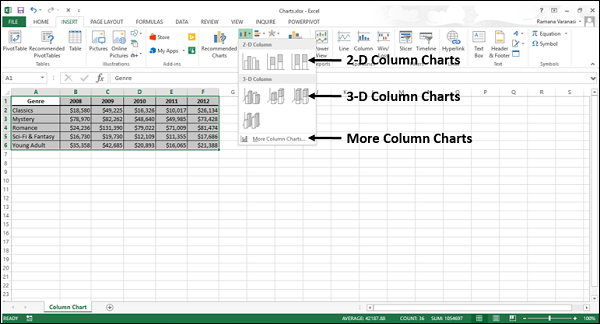
Step 4 − Move through the Column Chart options to see the previews.
Step 5 − Click Clustered Column. The chart will be displayed in your worksheet.
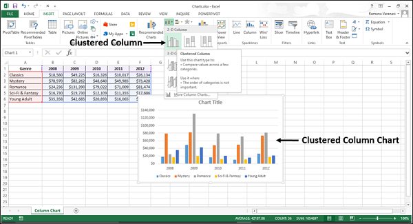
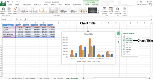
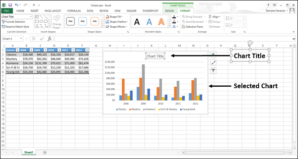
Step 6 − Give a meaningful title to the chart by editing Chart Title.
Creating Charts with Recommended Charts
You can use the Recommended Charts option if −
You want to create a chart quickly.
You are not sure of the chart type that suits your data.
If the chart type you selected is not working with your data.
To use the option Recommended Charts, follow the steps given below −
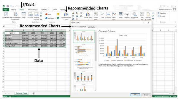
Step 1 − Select the data.
Step 2 − Click the Insert tab on the Ribbon.
Step 3 − Click Recommended Charts.
A window displaying the charts that suit your data will be displayed, under the tab Recommended Charts.
Step 4 − Browse through the Recommended Charts.
Step 5 − Click on a chart type to see the preview on the right side.
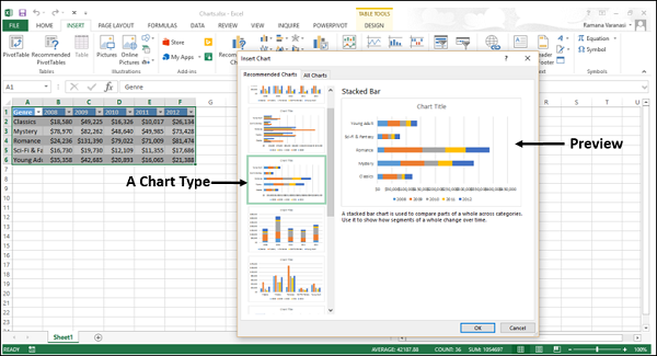
Step 6 − Select the chart type you like. Click OK. The chart will be displayed in your worksheet.
If you do not see a chart you like, click the All Charts tab to see all the available chart types and pick a chart.
Step 7 − Give a meaningful title to the chart by editing Chart Title.
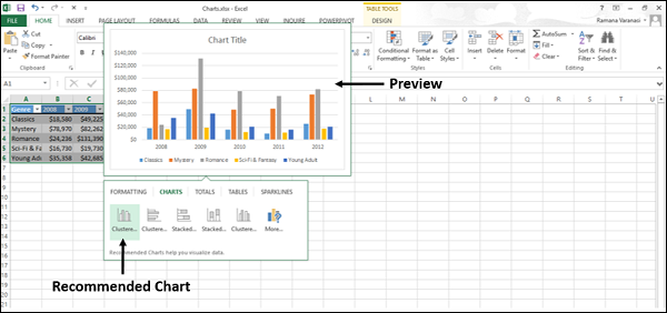
Creating Charts with Quick Analysis
Follow the steps given to create a chart with Quick Analysis.
Step 1 − Select the data.
A Quick Analysis button  appears at the bottom right of your selected data.
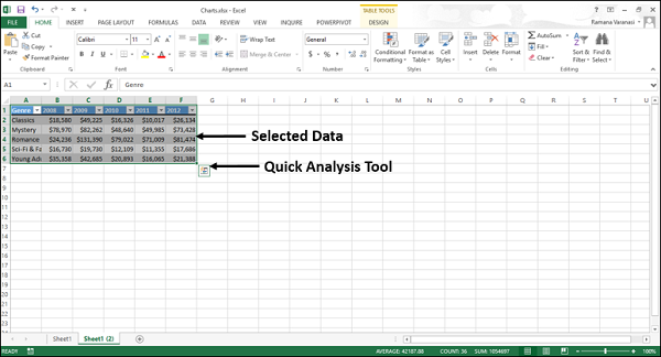
Step 2 − Click the Quick Analysis icon.
The Quick Analysis toolbar appears with the options FORMATTING, CHARTS, TOTALS, TABLES, SPARKLINES.
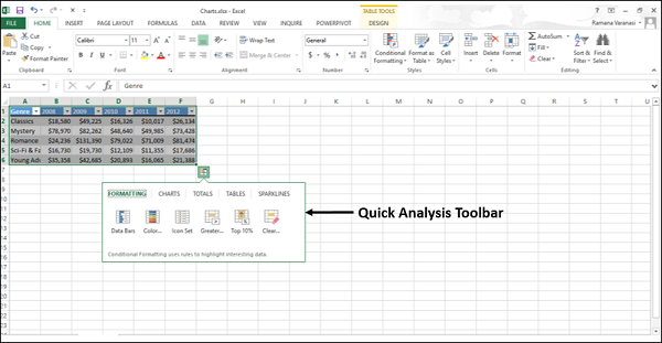
Step 3 − Click the CHARTS option.
Recommended Charts for your data will be displayed.
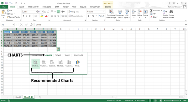
Step 4 − Point the mouse over the Recommended Charts. Previews of the available charts will be shown.
Step 5 − Click More.
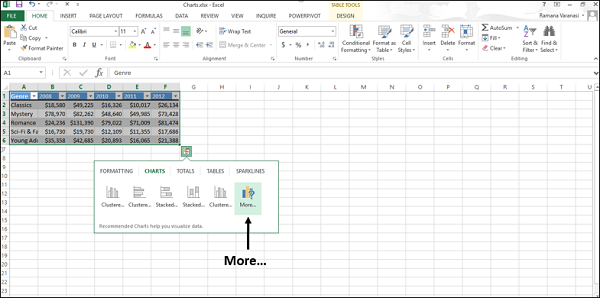
More Recommended Charts will be displayed.
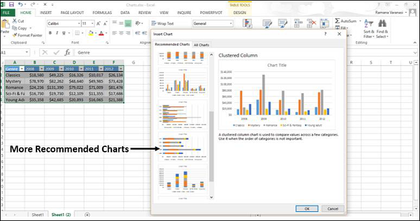
Step 6 − Select the type of chart you like, click OK. The chart will be displayed in your worksheet.
Step 7 − Give a meaningful title to the chart by editing Chart Title.
Surface charts are useful when you want to find the optimum combinations between two sets of data. As in a topographic map, the colors and patterns indicate the areas that are in the same range of values.
To create a Surface chart, ensure that both the categories and the data series are numeric values.
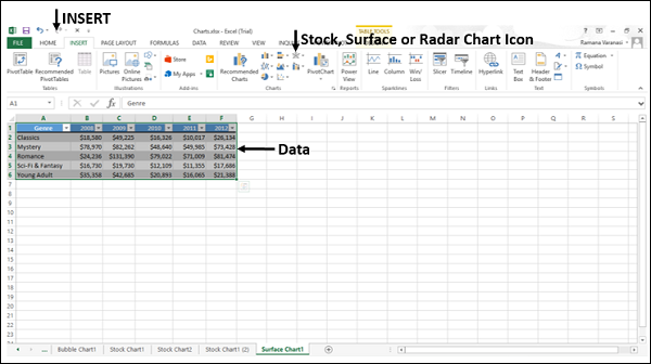
Step 1 − Arrange the data in columns or rows on the worksheet.
Step 2 − Select the data.
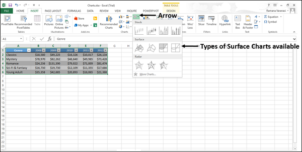
Step 3 − On the INSERT tab, in the Charts group, click the Stock, Surface or Radar Chart icon on the Ribbon.
You will see the different types of available Surface charts.
A Surface chart has the following sub-types −
- 3-D Surface
- Wireframe 3-D Surface
- Contour
- Wireframe Contour
Step 4 − Point your mouse on each of the icons. A preview of that chart type will be shown on the worksheet.
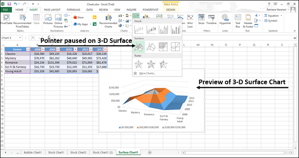
Step 5 − Double-click the chart type that suits your data.
In this chapter, you will understand when each of the Surface chart types is useful.
3-D Surface
3-D Surface chart shows a 3-D view of the data, which can be imagined as a rubber sheet stretched over a 3-D Column chart. It is typically used to show relationships between large amounts of data that may otherwise be difficult to see.
Color bands in a Surface chart −
Do not represent the data series
Indicate the difference between the values
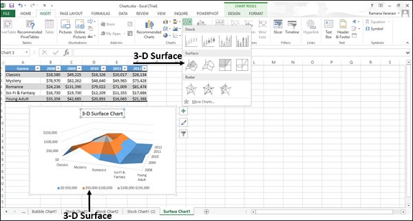
You can use a 3-D Surface chart −
When the categories and the series are both numeric values.
To show the trends in values across two dimensions in a continuous curve.
Wireframe 3-D Surface
A Wireframe 3-D Surface chart is a 3-D Surface chart shown without color on the surface. This chart shows only the lines. A Wireframe 3-D Surface chart is not easy to read, but it can plot large data sets much faster than a 3-D Surface chart.
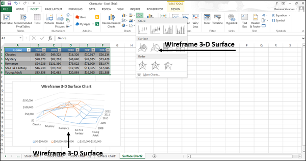
You can use a Wireframe 3-D Surface chart −
To show the trends in values across two dimensions in a continuous curve.
When the categories and the series are both numeric values.
When the data curves behind itself.
Contour
Contour charts are Surface charts viewed from above, similar to the 2-D topographic maps.
In a Contour chart,
The color bands represent specific ranges of the values.
The lines connect the interpolated points of equal value.
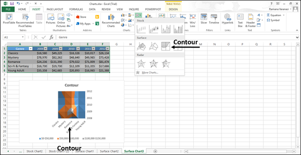
Use Contour chart −
To show the 2-D top view of a 3-D surface chart.
To represent the ranges of the values using color.
When both the categories and the series are numeric.
Wireframe Contour
Wireframe Contour charts are also Surface charts viewed from above. A Wireframe chart shows only the lines without the color bands on the surface. Wireframe Contour charts are not easy to read. You can use a 3-D Surface chart instead.
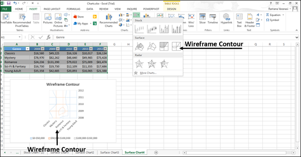
Use Wireframe Contour chart
To show the 2-D top view of a 3-D Surface chart only with lines.
Both the categories and the series are numeric.
Consider using a Contour chart instead, because the colors add detail to this chart type.
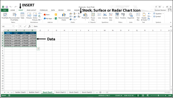
Stock charts, as the name indicates are useful to show fluctuations in stock prices. However, these charts are useful to show fluctuations in other data also, such as daily rainfall or annual temperatures.
If you use a Stock chart to display the fluctuation of stock prices, you can also incorporate the trading volume.
For Stock charts, the data needs to be in a specific order. For example, to create a simple high-low-close Stock chart, arrange your data with high, low, and close entered as column headings, in that order.
Follow the steps given below to insert a Stock chart in your worksheet.
Step 1 − Arrange the data in columns or rows on the worksheet.
Step 2 − Select the data.
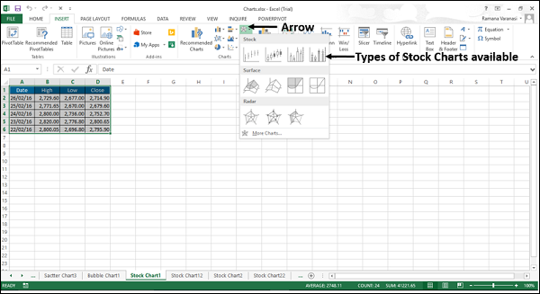
Step 3 − On the INSERT tab, in the Charts group, click the Stock, Surface or Radar chart icon on the Ribbon.
You will see the different types of available Stock charts.
A Stock chart has the following sub-types −
- High-Low-Close
- Open-High-Low-Close
- Volume-High-Low-Close
- Volume-Open-High-Low-Close
In this chapter, you will understand when each of the Stock chart types is useful.
High-Low-Close
The High-Low-Close Stock chart is often used to illustrate the stock prices. It requires three series of values in the following order- High, Low, and then Close.
To create this chart, arrange the data in the Order - High, Low, and Close.
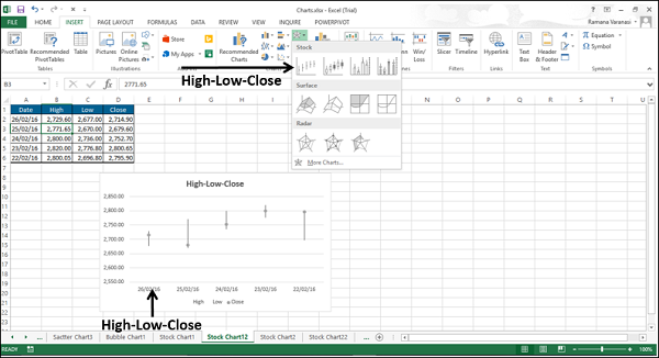
You can use the High-Low-Close Stock chart to show the trend of stocks over a period of time.
Open-High-Low-Close
The Open-High-Low-Close Stock chart is also used to illustrate the stock prices. It requires four series of values in the following order: Open, High, Low, and then Close.
To create this chart, arrange the data in the order - Open, High, Low, and Close.
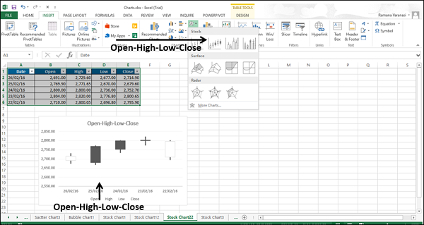
You can use the Open-High-Low-Close Stock chart to show the trend of STOCKS over a period of time.
Volume-High-Low-Close
The Volume-High-Low-Close Stock chart is also used to illustrate the stock prices. It requires four series of values in the following order: Volume, High, Low, and then Close.
To create this chart, arrange the data in the order − Volume, High, Low, and Close.
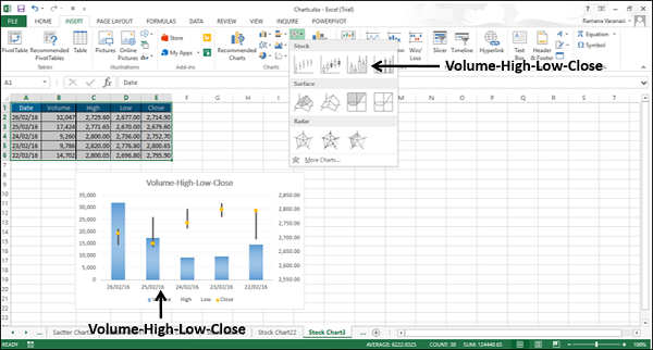
You can use the Volume-High-Low-Close Stock Chart to show the trend of stocks over a period of time.
Volume-Open-High-Low-Close
The Volume-Open-High-Low-Close Stock chart is also used to illustrate the stock prices. It requires five series of values in the following order: Volume, Open, High, Low, and then Close.
To create this chart, arrange the data in the order - Volume, Open, High, Low, and Close.
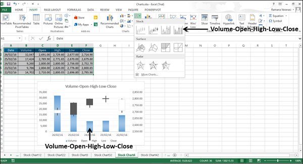
You can use the Volume-Open-High-Low-Close Stock chart to show the trend of stocks over a period of time.
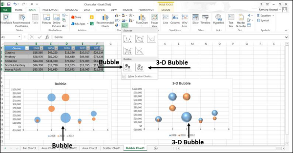
A Bubble chart is like a Scatter chart with an additional third column to specify the size of the bubbles it shows to represent the data points in the data series.
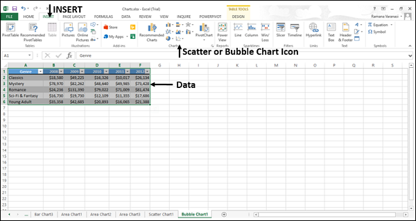
Step 1 − Place the X-Values in a row or column and then place the corresponding Y-Values in the adjacent rows or columns on the worksheet.
Step 2 − Select the data.
Step 3 − On the INSERT tab, in the Charts group, click the Scatter (X, Y) chart or Bubble chart icon on the Ribbon.
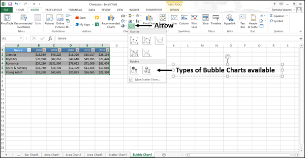
You will see the different types of available Bubble charts.
A Bubble chart has the following sub-types −
- Bubble
- 3-D Bubble
Step 4 − Point your mouse on each of the icons. A preview of that chart type will be shown on the worksheet.
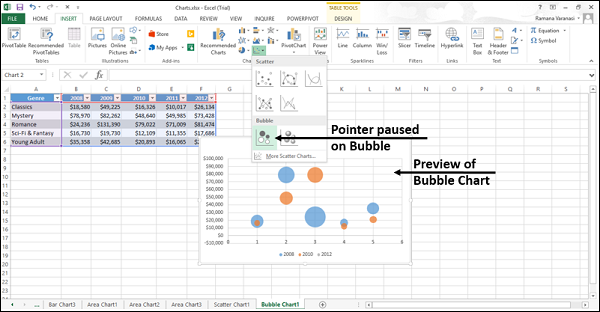
Step 5 − Double-click the chart type that suits your data.
In this chapter, you will understand when the Bubble Chart is useful.
Bubble and 3-D Bubble
Bubble and 3-D Bubble charts are useful to compare three sets of values and show relationships between the sets of values. The third value specifies the size of the bubble.
A Bubble chart shows the data in 2-D format. 3-D Bubble chart shows the data in 3-D format without using a depth axis